High Mobility
Redesigned & implemented Next-Gen Connected Vehicle Platform
- Company
- High Mobility
- Role
- Lead Product Designer
- Team
- +7
- Year
- 2024–2025
- Market
- B2B, Mobility
I led UX and interaction design for the High Mobility Console, the web app customers use to access connected car data. End to end, from research to shipped product, balancing user needs with business goals.
Challenge
High Mobility Console is a connected car data platform. It gives fleet managers access to more than 600 data points from over 20 car makers.
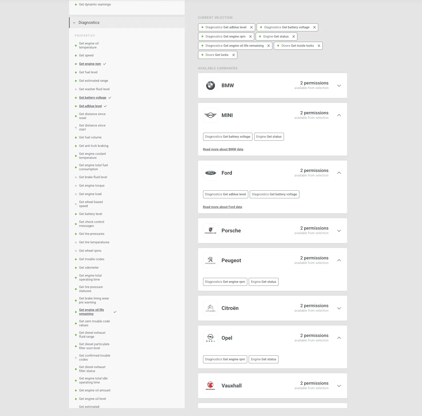
Demand was strong, but the product couldn’t scale. Users signed up, revenue didn’t follow. Support was flooded with the same questions, and self-service was close to impossible. My job was to turn that friction into a product people could use on their own.
Process
Research
We ran interviews with 10 customers, asked targeted questions about their workflows, and reviewed analytics. Three problems kept coming up:
DataUsers didn't know what data was available or what each package included.
FlowProjects were hard to edit once submitted, which caused delays and drop-offs.
CollaborationUsers couldn't invite teammates or share responsibility.
Support tickets, Slack feedback and BI data confirmed it. 20% of users dropped off before submitting a project, and 30% of small manual payments (under €1.50) failed.
Priorities
We grouped the problems into four themes: submission flow, data access, payments and collaboration. With product and engineering, we ranked them by user impact and effort, then agreed a quarterly roadmap with leadership around three goals:
- Shorter time from project start to live
- More packages bought through self-service
- More platform use, lower support cost
Exploration
We sketched together across design, product and engineering, then built interactive prototypes in Webflow and tested them with users and stakeholders. Research had shown data structure was the core blocker, so we started there and proposed a brand-first model with pricing and availability in one place.
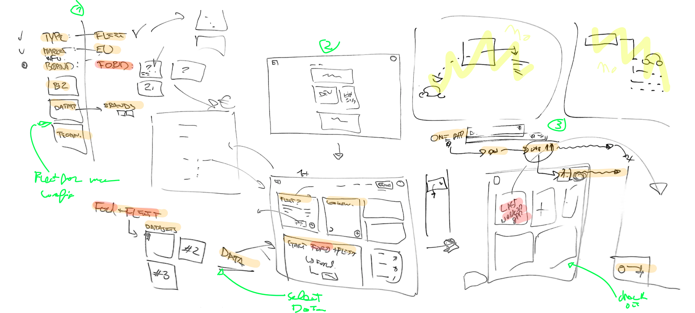
Leadership input shaped the direction:
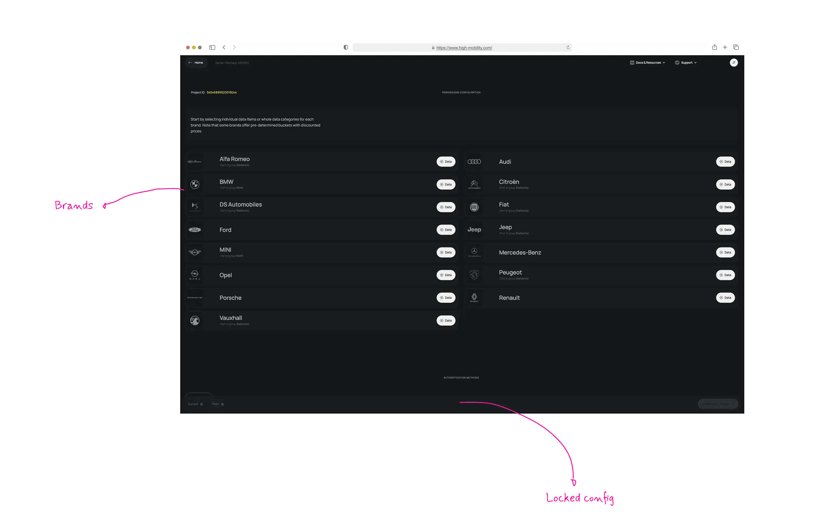
CTO"Core configurations like consent type and market always visible and locked."
CEO"A modular system will ensure seamless expansion, allowing the platform to adapt."
Head of Business"Price needs to be clear and transparent."
Key solutions
1. A brand-first data model. We replaced the nested structure with data organised by car maker and package, prices shown next to the data, a clear view of selected and available brands, and wording that matches how customers talk.
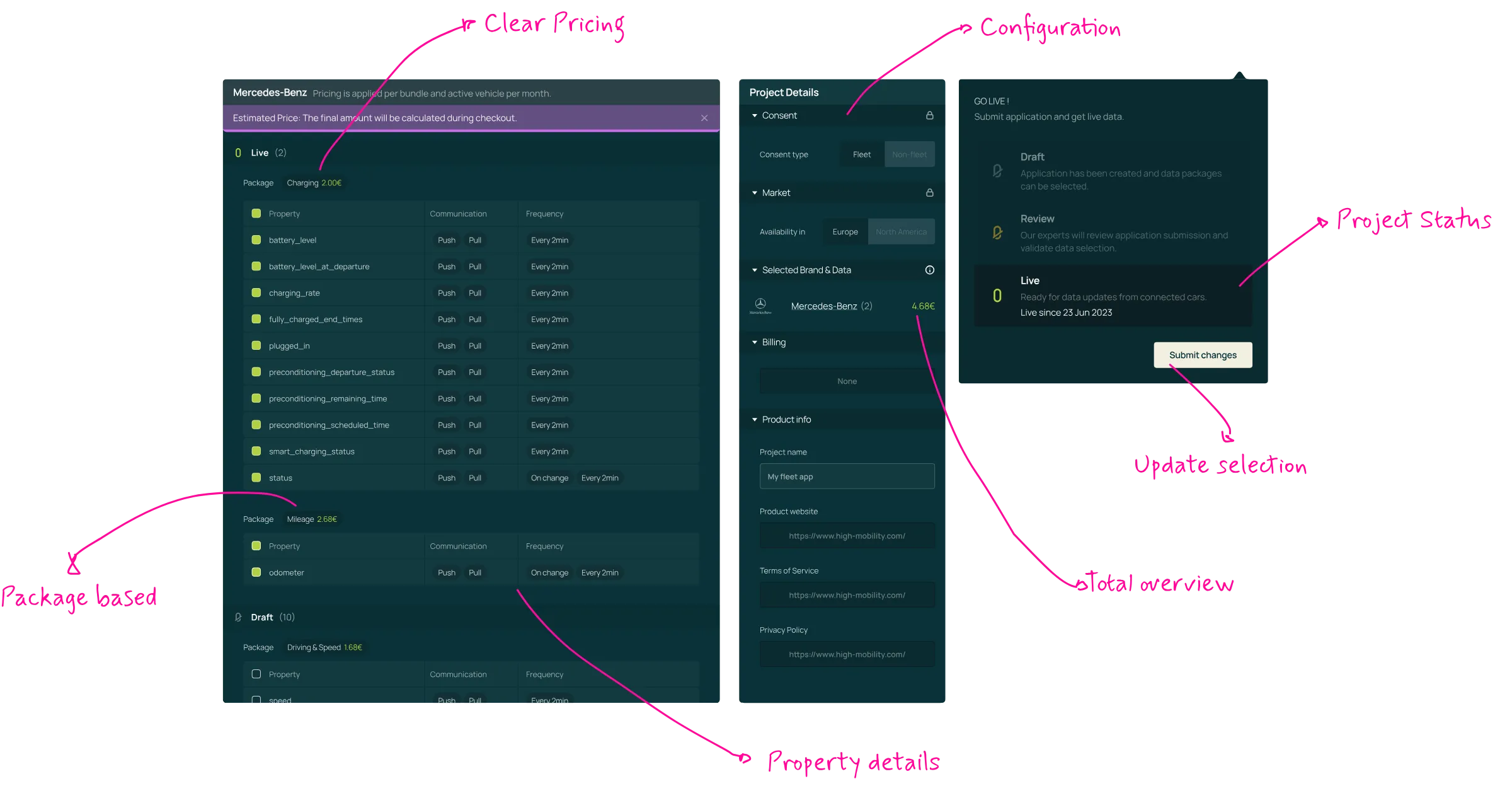
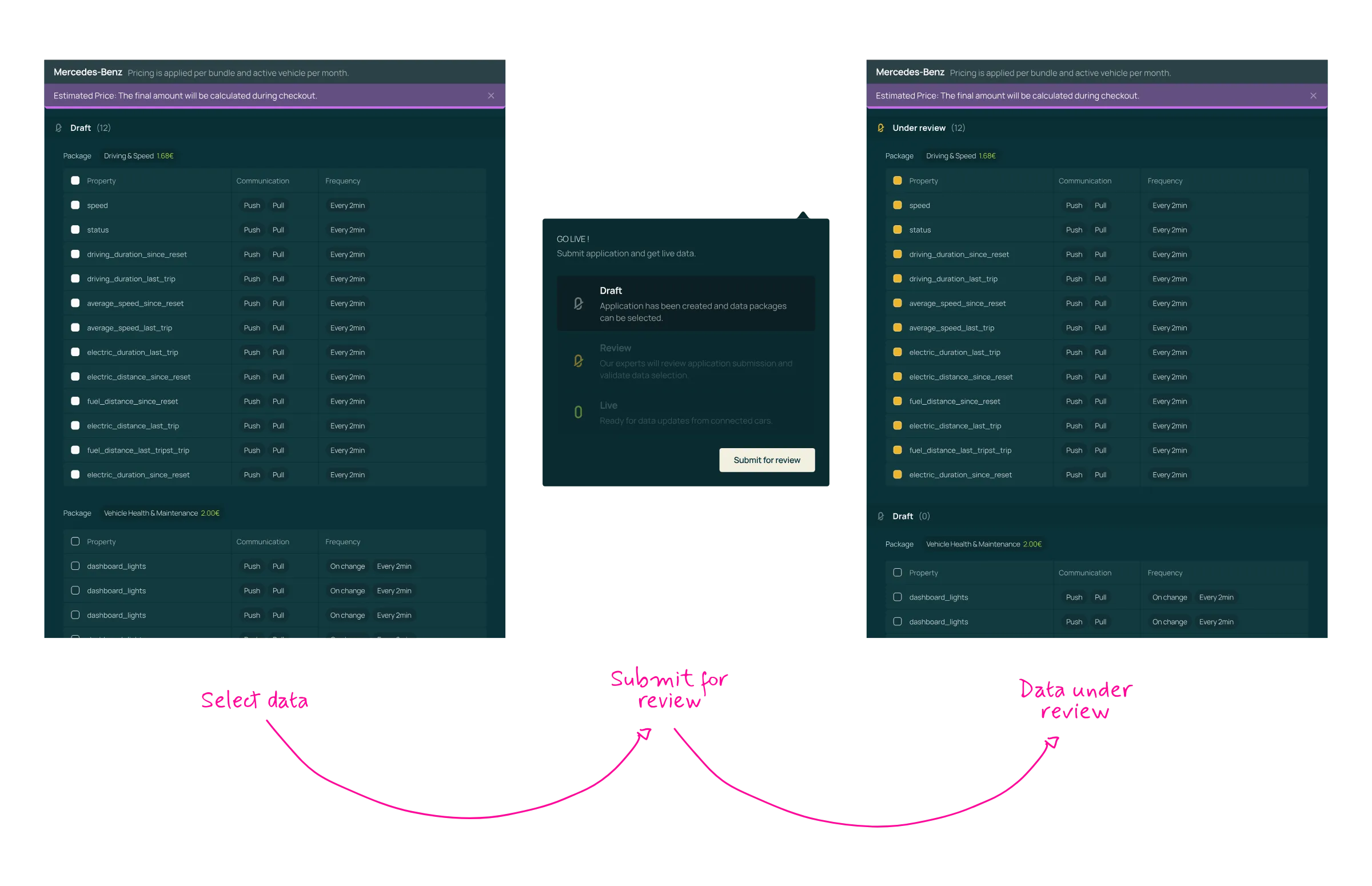
2. A clear project lifecycle. Projects now move through Draft, Under Review and Live. Users can edit and resubmit, track progress and solve most issues without support. Time to live dropped to under an hour and drop-off halved.
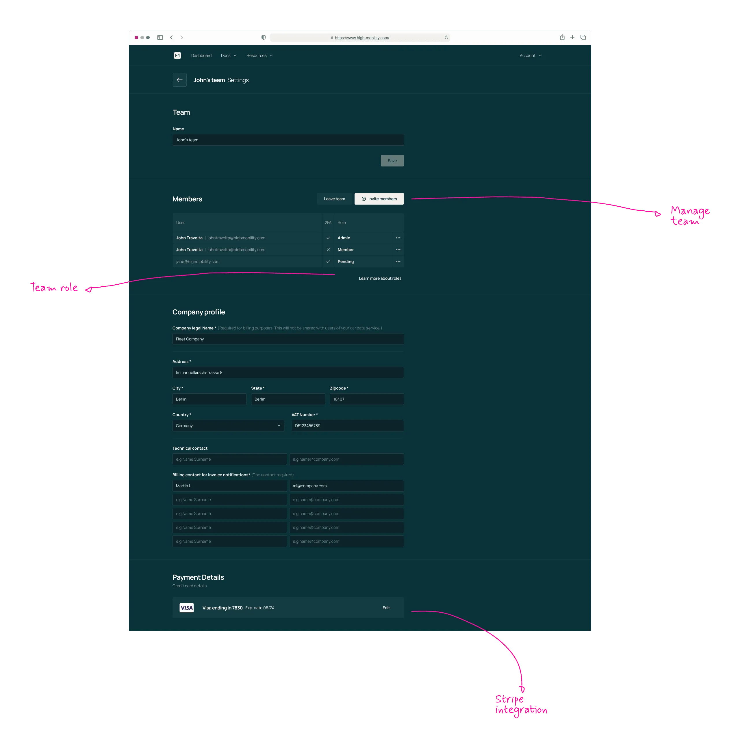
3. Collaboration and payments. Role-based permissions (Admin, Editor, Viewer) let teams work together securely. Stripe card payments replaced manual invoicing, which cut failed transactions and delays.
Impact
By removing friction from discovery to payment, the platform could grow without growing the support team.
Time to live: from several days to under 1 hour.
Adoption
Self service
Support load
+20%Active vehicles per month
90%Projects now self-served
-50%Support tickets
What I learned
The interface wasn’t the real problem. People didn’t understand what data they were buying, so fixing the data structure did more than any screen redesign. If I did it again, I’d bring support and sales into research from day one, because their tickets told us more than analytics did. I’ve kept that habit since: support load is one of the first numbers I look at.